Internal Tools: Scheduler & Page builder

Scheduler Tool (left) and Page Builder Tool (right)
Background
With the global expansion of HBO Max on the horizon, we saw an opportunity to enhance the current tooling system. As we looked at improving our content strategy to target distinct user groups, regions, and devices, we needed a flexible system to enable us to curate content for each of these groups.
Problem
The current system was not efficient in managing content edits across multiple pages and dates. Adding new dimensions by which the team needs to make changes would cause an unsustainable increase in the amount of work (and time) publishers need to manage content curations.
How might we ensure publishing users are able to efficiently schedule and manage change requests across variations of content?
Role
Team lead - managed resources and approval of designs. Created wireframes, prototypes, facilitated ideation sessions, and conducted user interviews.
Discovery
The first thing we needed to do was understand how publishers were doing their tasks in the current system. I set up sessions where we could observe publishers doing their daily scheduling of content and building of pages. We found that there were lots of inconsistencies in the workflow due to workarounds forced by an inconsistent user experience. There were icons that were the same but did not do the same thing depending on where you found them, no error feedback when something was incorrectly scheduled, etc. Lots of basic usability challenges that we could easily fix when building a new system. I created a design backlog and began prioritizing tasks. I collaborated with product management leads to help determine priority.
The Approach
Engineering had designed an architecture system by which to build upon. This enabled us to partner closely with engineers to complete building out all the functionality we needed to make our system stable and robust. Our first project was focusing on the scheduler app, so we got a group together to start thinking through what that might look like. We used the existing UI system as a baseline to build upon; creating consistency in interactions, messaging, and functionality throughout the design process.

Scheduler flow
After the initial flow was roughed out, I started sketching to continue to think through how to communicate time slices and time slice groups (with variants).

Sketches for scheduler considerations
We explored layout of time slice variants. We got feedback from our users to see which layout made the most sense to them.
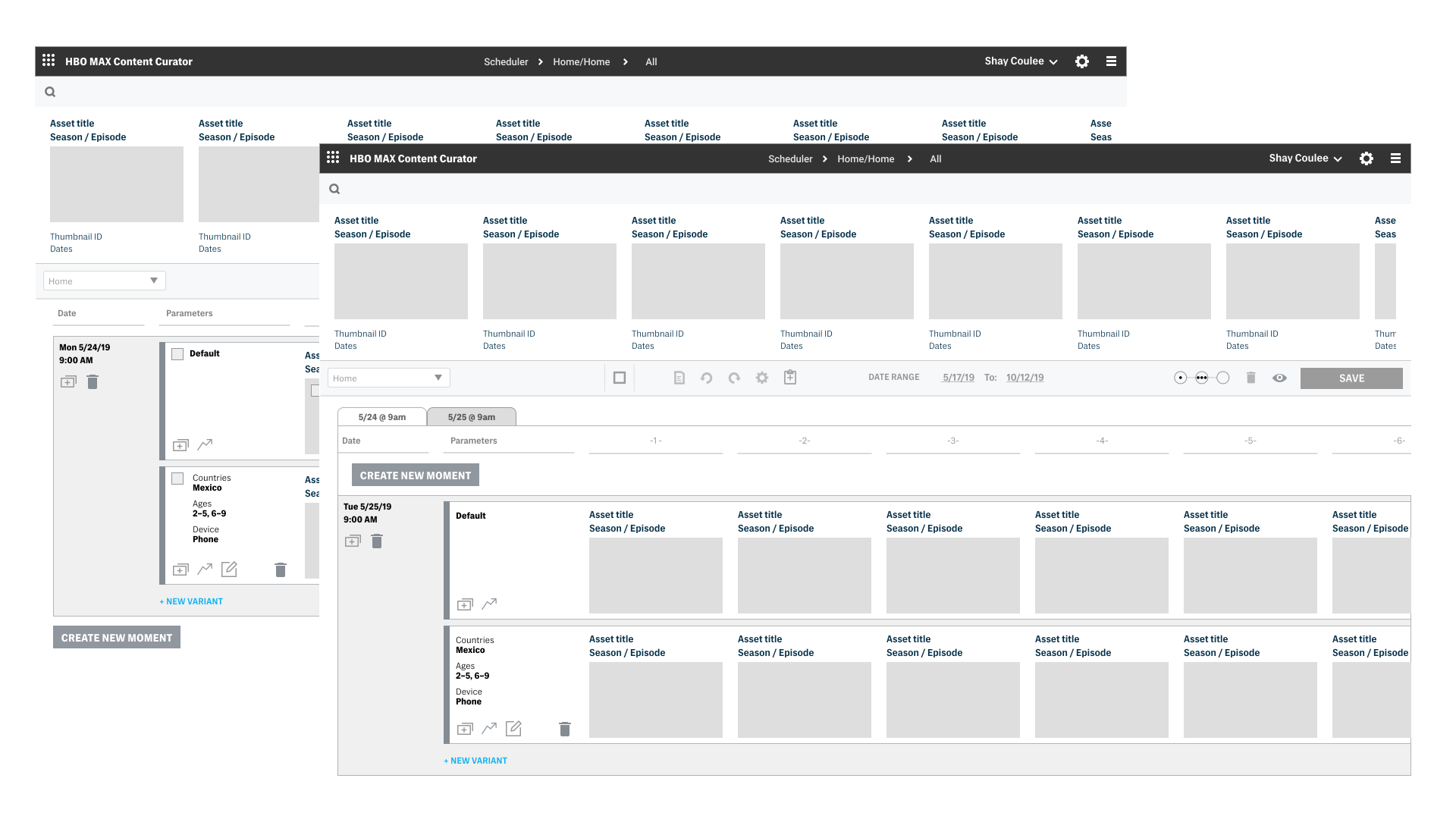
Scheduler Wireframes
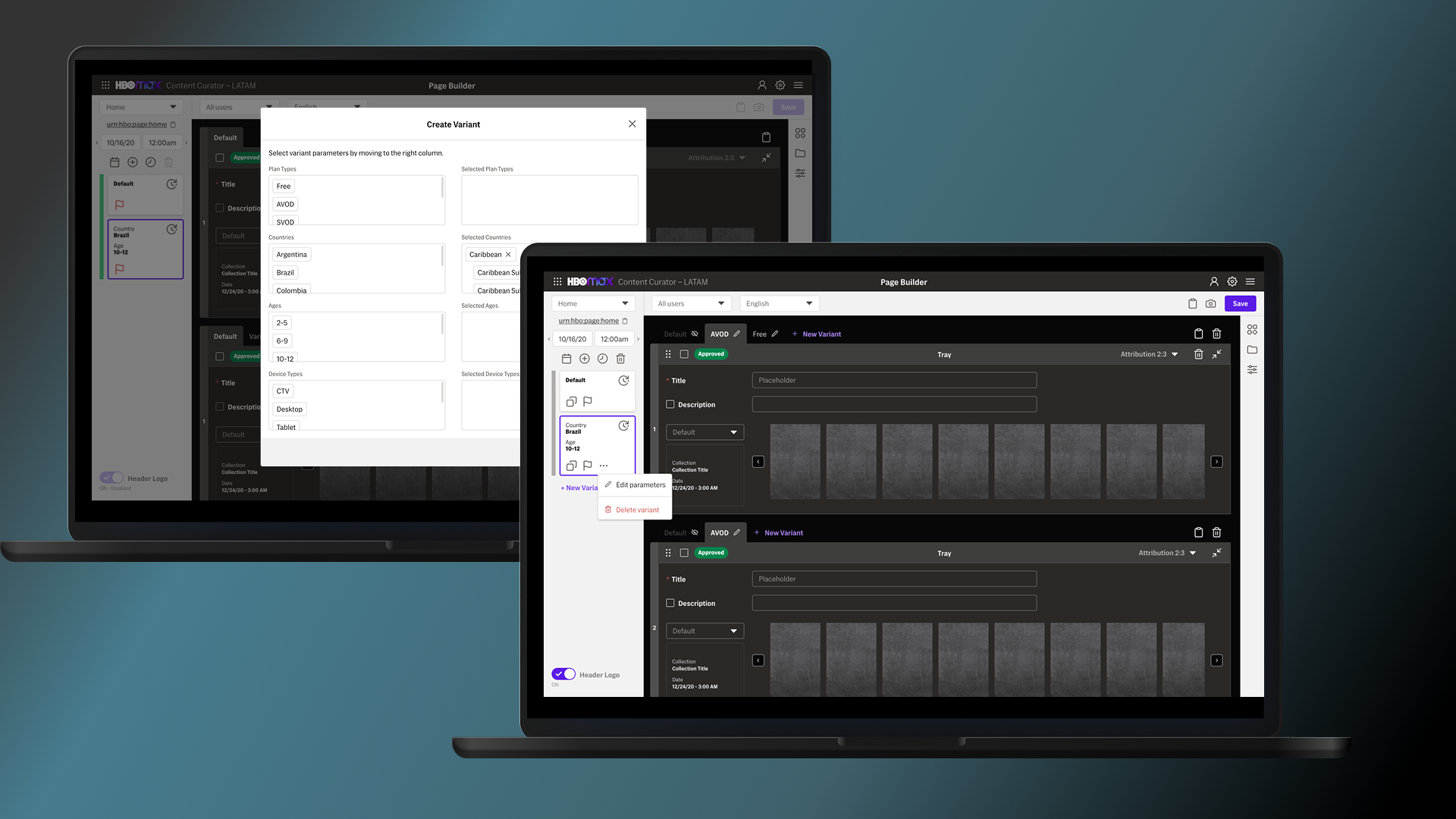
We started to mock up each scenario we needed, including a multi-select mode and an edit collection dialog, among others.

Final Scheduler app
What did we learn?
Most publishers were copying and editing a previously created collections of content rather than creating from scratch. The enhancements to the experience we created were enabling them to move faster through the tool.
Results
An increase in efficiency and a reduction of error rates meant less time had to be spent managing edits across multiple touchpoints.
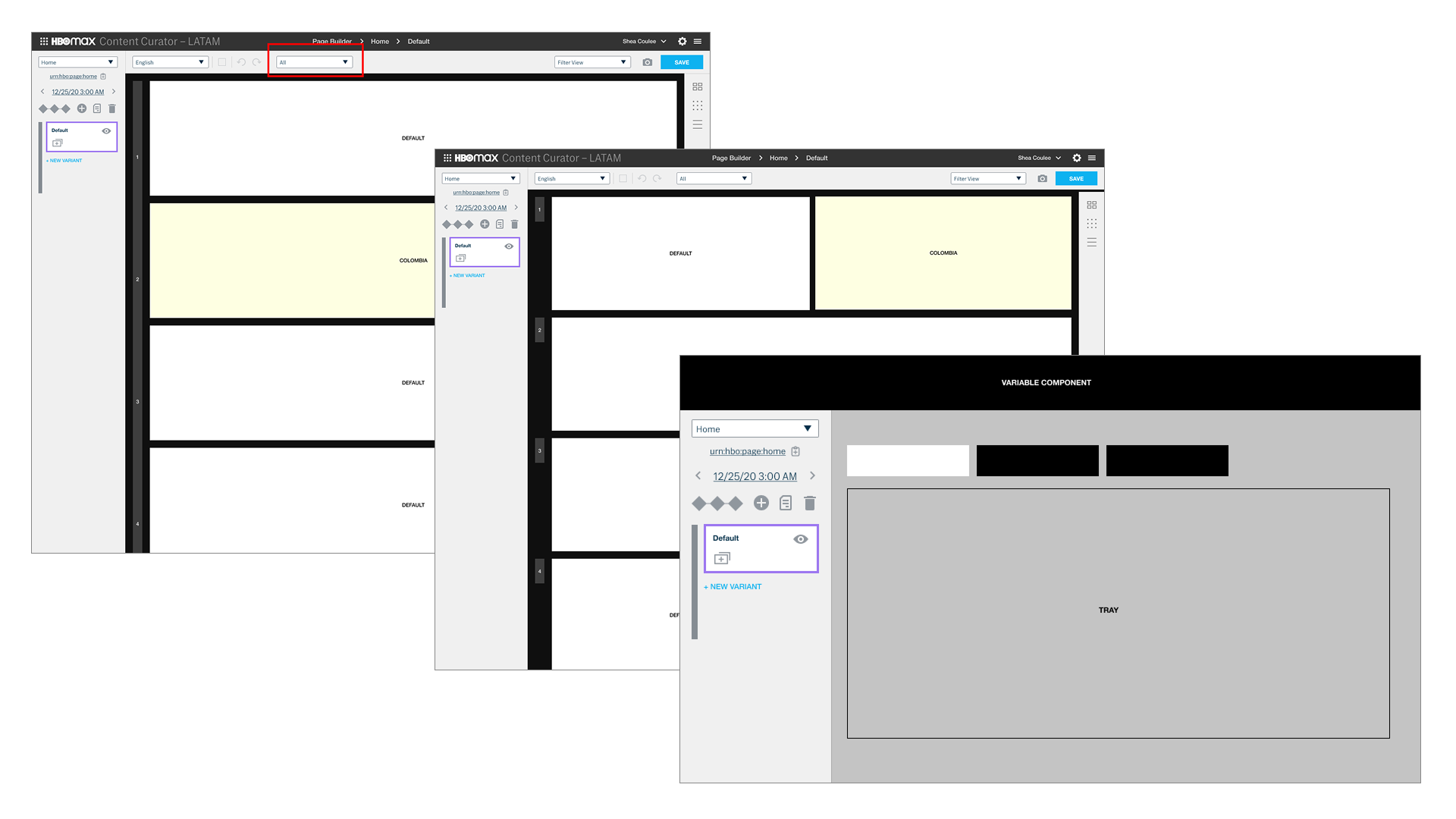
Wireframes for Page Builder Tool

Page Builder
Users could drag and drop components onto the page in specific positions.
Final Page Builder Tool app