hbo max: ctv navigation redesign
Background
We received feedback via usability testing that folks were having challenges finding things in our app.
Problem
The placement of the navigation along the top of the screen proved to be difficult for folks; they would have to scroll all the way back up with the remote in order to view any interior pages.
How might we explore different interactions for CTV navigation that feel natural to users?
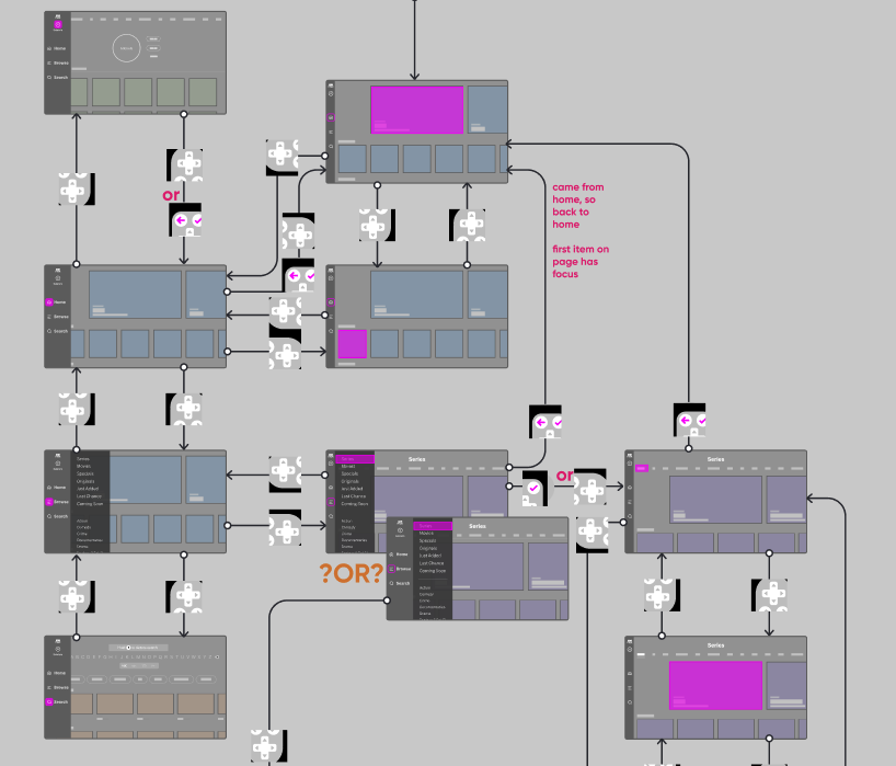
Role: Facilitated and participated in ideation and sketch sessions, wireframed concepts, and created low-fi prototypes tested on CTV.
Approach
UX research highlighted main pain points for our users, which seeded ideation and sketch sessions to determine which areas we wanted to explore further. We did a card sort with users to gain an understanding of their mental models (where they thought things should go). In collaboration with other designers, we worked on the information architecture. Once we were all aligned there, we started explorations in wireframes. We tested each direction in prototypes on physical CTVs. Once a direction was chosen it got kicked over to visual design for polish, then it was development ready.
Results
Enhanced usability of the navigation increased engagement. We saw a decrease in the number of customer service calls resulting in lower support costs.